Jan & Feb 2025
Published at Mar 2, 2025
January
I started the year by revamping the homepage of my personal website. I wanted a more fluid way to showcase my past client and side projects—something that better reflected how I see them. Instead of a rigid layout, I opted for a design where images appear randomly scattered across the surface, creating a more organic feel.
Right after completing the revamp, I began my first client project of the year: converting multiple Figma-designed dashboard pages into a Svelte app using Tailwind CSS. The main challenge was transforming raw data from Excel spreadsheets into a format that allowed for seamless filtering via multiple dropdown menus on the frontend. Ensuring responsiveness was another hurdle, given the high content density on each page. I tackled this by leveraging various Tailwind techniques.
I also reconnected with a previous client who wanted me to upgrade a React.js dashboard I had built for her, integrating a new dataset and additional features.
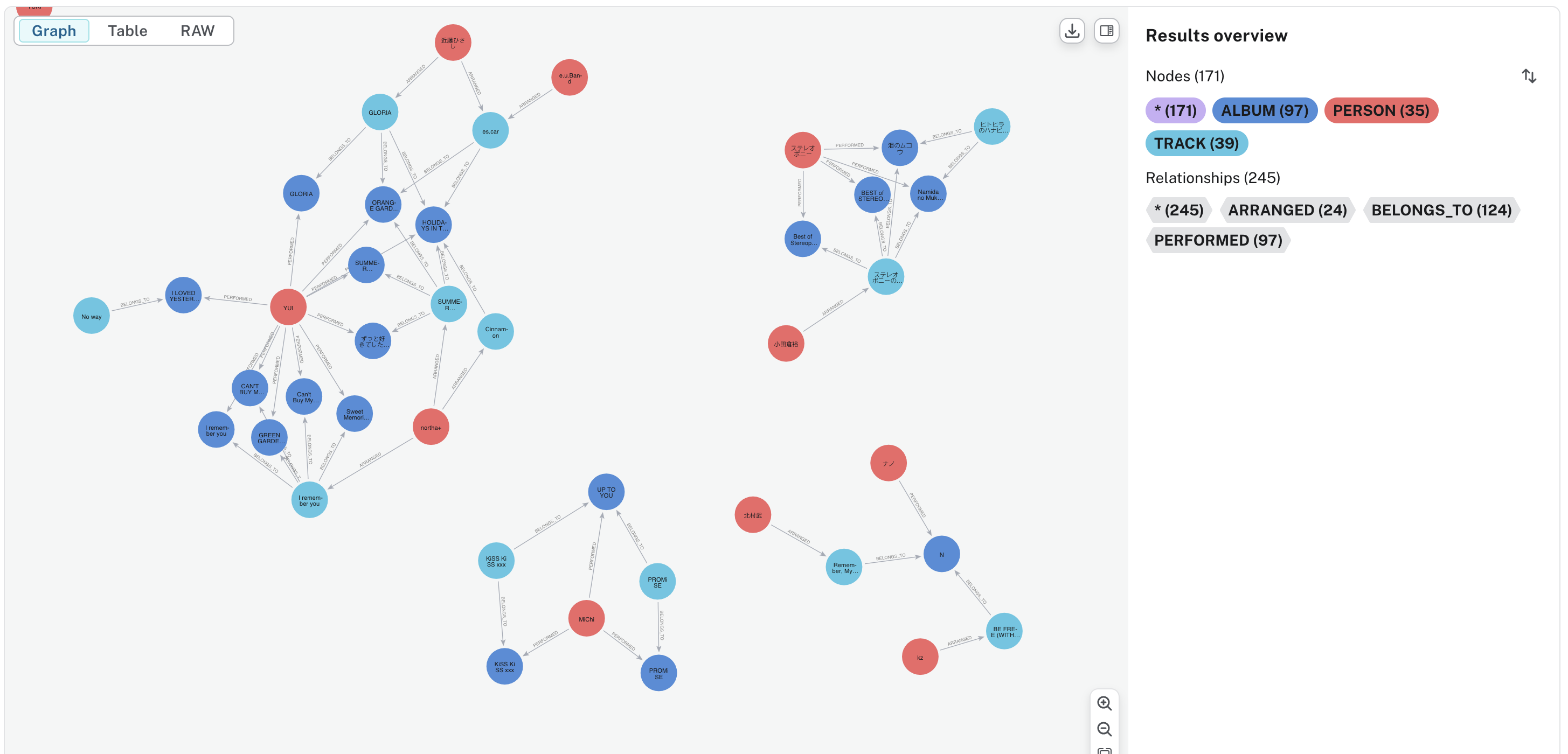
Meanwhile, I’d been contemplating upgrading my Korean and Japanese music network visualization project into a public-facing product. To expand its scope, I decided to switch the data source from Spotify to MusicBrainz, as the latter offers broader coverage of East Asian artists—especially Japanese acts that aren’t available on Spotify. I set up a Python backend to connect to the MusicBrainz API, batch-extract artist, album, and song data, and wrote a Cypher script to ingest it into Neo4j. However, before extracting the full dataset, I wanted to refine the Python script to avoid the hassle of re-extracting large amounts of data later. Here’s a preview of a data sample in Neo4j:
February
February was spent pushing both client projects toward completion. In between, I wrote a blog post breaking down the implementation of the interactive React dashboard I had built for a client, focusing on React patterns for performance optimization and maintainability. Revisiting the code, originally written two years ago, made me realize how much it can be written better, and I felt compelled to refactor and improve it based on what I have learned about React since.
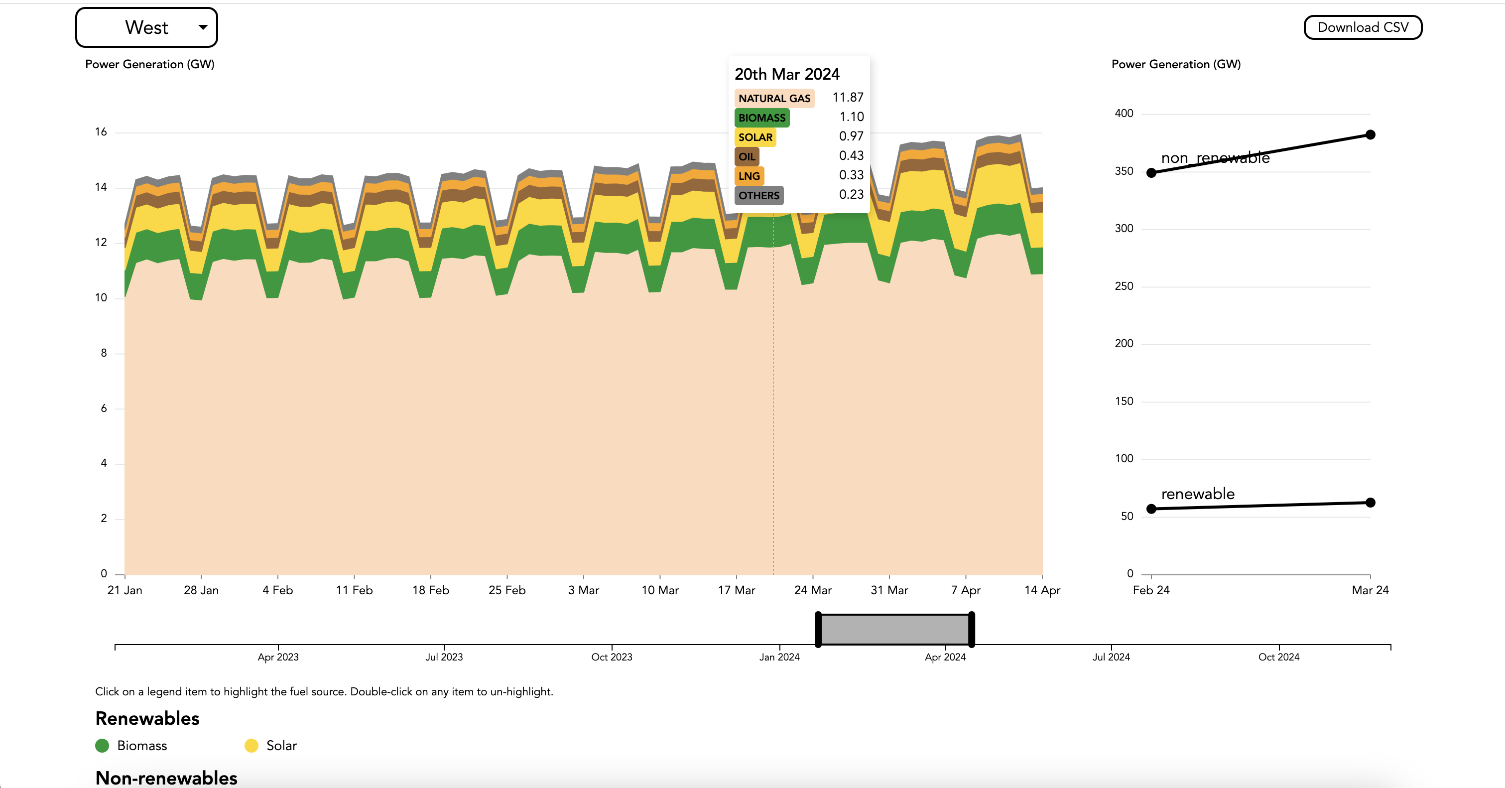
Around mid-February, a new client approached me with a dataset visualization request, inspired by a past project involving an interactive stacked area chart. While I needed to write a new Python script to parse and transform the data, once that was in place, I was able to reuse the existing Svelte components with minimal modifications to render the charts. I also extended the visualization by adding new features, including a brushable timeline, CSV download button and a language translation toggle. Additionally, I refined the axis tick labeling for improved clarity. Here’s the visualization (using mock data):
Before the month ended, I squeezed in another blog post, this time diving into the backend implementation of the React dashboard.
Looking back, January and February had a recurring theme of ‘reactivating’ past work-— upgrading and refining previous projects. In March, I plan to finally complete a project that has been sitting at 90% for the past four months (time flies!). If time permits, I’ll also continue developing my music graph visualization project.